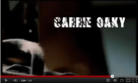
The most important conventions in this task, were the fact that you needed to be able to see the titles (size and placement), and they should be on the screen for a sufficient and equal amount of time. They also needed to be kept in the same colour, font and size throughout, to maintain the same theme and institutional identity. It is important to include all the names legally required (director, actors, producers, etc.), however since we were not using the actual names, this did not matter in this task.
2. How did your group plan to edit the title sequence? (consider timings, industry requirements etc).
We planned to edit the title sequence to include 11 credits, to appear over parts of the sequence which we felt had the space and the need for a title. We used moments where the screen is partially empty, or filled with a block of colour, where a title would look effective, and easy to read, we also used the action taking place, such as the swirling of coffee, or the swiping motion of a knife to coincide with the appearance of our credits. We knew that the titles needed to be on screen for relatively equal amounts of time, though we did not specifically time this, something which would need to be done in a real title sequence, due to the legalities related to TV productions.

3. Explain the creative decisions made by your group.
We used a font called 'Insomnia', which was a blocky capitalized font, with slashes through the letters, we thought this was appropriate for the style and genre of the title sequence. We made the titles white, as this colour stood out dramatically, no matter what the image behind would be. The effects we used were different for each title, as we wanted to relate them to the image behind, we had some credits lurching, which is typical for the crime genre, and other credits followed the motion of the action taking place, for example a knife slicing across the scene.
4. How does your re-edit compare to the original?
Compared to the original, our edit had significantly less titles, and we had not included the job titles of each name appearing, apart from the director at the end. While we had used a white font, to show up, the original used a dark red font, which was more clean cut, we can see that this font works in synergy with the title used at the start and finish of the title sequence, and this links the whole clip together. However, I did think that some of these titles were hard to read during the sequence. Like our edit, the original contained titles appearing in relation to the action taking place, but since we were not working with sound, the original also responded to the aural cues.

No comments:
Post a Comment